Our Exclusive Services

What is Motion printing
Flip Effect
3D Effect
Morph Effect
Zoom Effect
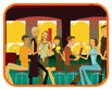
Full Motion Video
Combination Effect
MotionPrint is an optical effects process involving lenticular lenses to produce images with an illusion of depth (3D), or the ability to change or move (animation/flip/morph) as the image is viewed from different angles. The technology was created in the 1940’s but has evolved hugely in the recent years to show more motion and increased depth.
Applications for MotionPrint are endless; direct mail pieces, point of sale products, posters, packaging, large format Out of Home Media, stamps, retail products such as cards, magnets, puzzles and cups.
There are several MotionPrint effects to chose from and you don’t need to do anything complicated to your artwork to create these stunning effects – leave that to us! To make sure you get the best results, we do have a couple of pointers to help.
Flip Effect
DO use two frames in the Flip Effect. The key to Flip Effects is simplicity. More than two frames can be used, but fewer frames is preferred for a clearer, more effective message. DON’T use white as a background colour as it is more likely to cause ghosting, and try to avoid using really dark colours as a background as this will obscure the animation. DON’T have type overlapping. We do not recommend having typography flip to more typography. It does happen and with a little bit of trial and error, flip typography can be effective. DON’T use a very small type with Flip Effects. Try to avoid using smaller type styles in lenticular prints as the lenticular screen will reduce readability.
Zoom Effect
DO consider two major factors: colour choice and image placement in producing the Zoom Effect. DO use bright, strong imagery to produce the best Zoom Effect results. DO use a separate layer on your design for the Zoom Effect if you have more than one lenticular effect in your design. The Zoom Effect may be used for icons, logos or type. DON’T use white or really light coloured backgrounds. Light coloured backgrounds can be used, but are best avoided as they are more likely to cause ghosting.
Full Motion Video Effect / Combination Effect
DO run lines horizontally otherwise images will become fuzzy. With vertical animation you may see more than one image at the same time. DO consider the viewer’s distance from the image as the focal length is important for viewing the lenticular image. You must know how far away the image is going to be viewed before interleaving is started. DO start with video films or equivalent to get the next frame movement for animations. Computer generated art is also good. DO use at least BETA-S or BETA-SP for video. Videos MUST be from a professional photographer, NO VHS! 35 MM Movie film is great. DON’T try to make the animation overly complex or else the design becomes too busy and will not produce an effective lenticular animation. DON’T have movement that goes from one side of the card to the other. Not all sequences are candidates for animation. Michael Jordan running down the court is a bad example. Michael Jordan dunking the ball at the basket is much better. DON’T use full motion animation for POP. Lenticular POP displays have to use vertical lenticules (single lenticular lens), which means full animation is not appropriate for lenticular POP material. Limited motion is okay for POP, and in most cases, the animation should be sized as if for a handheld piece. DON’T use really small type with the Full Motion Video Effect as the lenticular screen will reduce readability.
Morph Effect
DO use a minimum of three frames for a Morph Effect. The Morph Effect starts with one image and slowly transforms into another image. You need the images for the start, the end and the frames between. DO include elements similar in shape and colour in your design as this will create a clean morph from start to end for a perfect Morph Effect. A red square morphing to a red circle will be an effective Morph Effect. DON’T use really small type as the lenticular screen will reduce readability. Ghosting can also occur if you have animating elements in your design that are not close enough to each other.
3D Effect
DO consider two major factors: colour choice and image placement when going for the perfect 3D look. DO use bright, light imagery to produce the best 3D Effect results. Psychologically, cooler colours tend to recede and warmer colours tend to project. Elements that overlap slightly with good depth cues will enhance the illusion of depth. DO use logos and typography near the aim-point where they will appear the sharpest and most readable. DO use soft, less detailed images for the best effect on the background and foreground layers instead of using overly complex images which will only decrease the 3D Effect. DON’T use backgrounds with solid horizontal stripes if possible, as this cannot create a depth reference for the observer.
Font/ Type Style Tips
DO try outlining the type by using stroke on the type if the font you choose is hard to read. Using the type in other stroke styles may increase readability under the lenticular lens. The larger the LPI the larger the font has to be. DON’T use serif and italic font styles. They lose definition under the lenticular len DON’T use fancy or complicated font styles as they result in reduced readability under the lenticular lens.